Excel
by Mike Thompson, Updated 7/11/2016
Excel is it, as far as spreadsheets are concerned. There's nothing else that's as fast and easy to use and offers so much horsepower. Excel fails when data sets get really big or you want to perform some really sophisticated automation on them, but for manipulating human-size collections of relational (rectangular) data, Excel is so good it's downright addictive. I think you could argue that Excel is the one application that really keeps Microsoft Windows on the map.
One thing you can do in Excel is produce visualizations of your data, and doing that got significantly easier with the release of Excel 2013. Here's a collection of visualizations that I created with Excel, including many of the stock ones: pie charts, bar charts, scatter diagrams, etc.
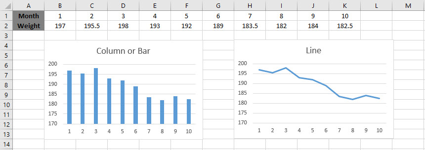
Weight Over Time - 10 Months of Trying To Get Skinnier
This data set contains one dimension that's a sequence (the months of January through October) and one measure that's continuous. This is the sort of data that you usually see shown as a line chart, but a column or bar chart will work well too.
Sales By Quarter
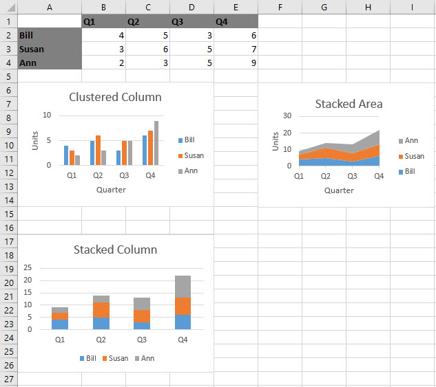
This data set contains one dimension that's a sequence, one that has low-cardinality (the Sales Department personnel), and one measure. These visualizations answer the typical, "What are our sales, by quarter, and who is selling how much?" questions. There are several options, and the one chosen is probably determine by whether you're more interested in seeing overall sales or in comparing the productivity of your sales people.
Sales By Product
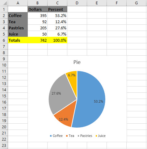
One low-cardinality dimension and one measure (well, two measures if you count Dollars as well as Percent, but I excluded Dollars when building the visualization). This is the sort of data that good ol' pie charts were made for!
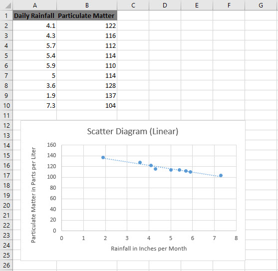
Particulates Vs. Rainfall
Two measures that are negatively correlated, as shown by the descending dashed linear regression line. Standard two-variable statistics stuff.
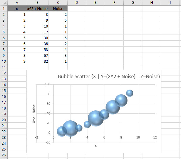
Signal Vs. Noise
Two measures that are quadratically correlated, with some noise introduced via the formula =RANDBETWEEN(1,5). With a bubble scatter you get to add one more measure into the visualization. Here the magnitude of the noise is represented by the size of the bubble.
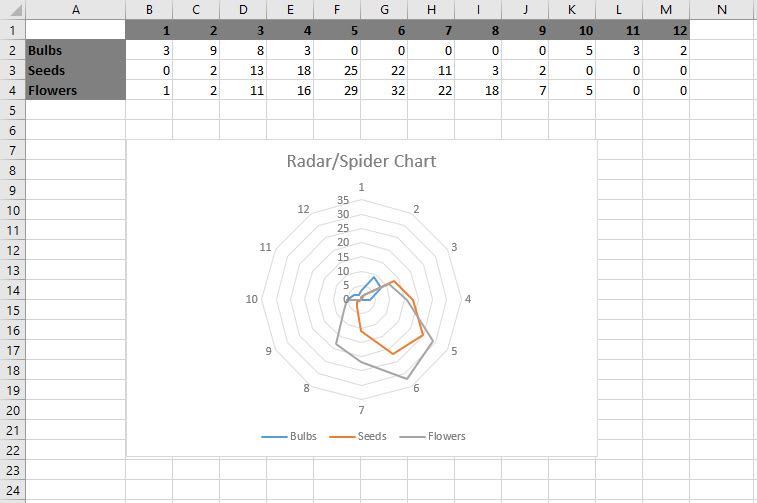
Nursery Sales Radar
A radar or spider chart is another way to visualize some periodic data with a low-cardinality dimension, which you're more likely to find in a stacked column or stacked area chart.
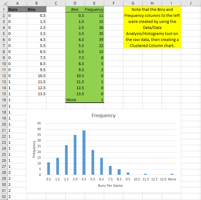
Baseball Histogram
Histograms are the classic way to visualize the distribution of measure, used by statisticians. Note that the number of runs scored per game over the course of a season yields what looks like a normal distribution, skewed right by a few high-scoring games.
Waterfall
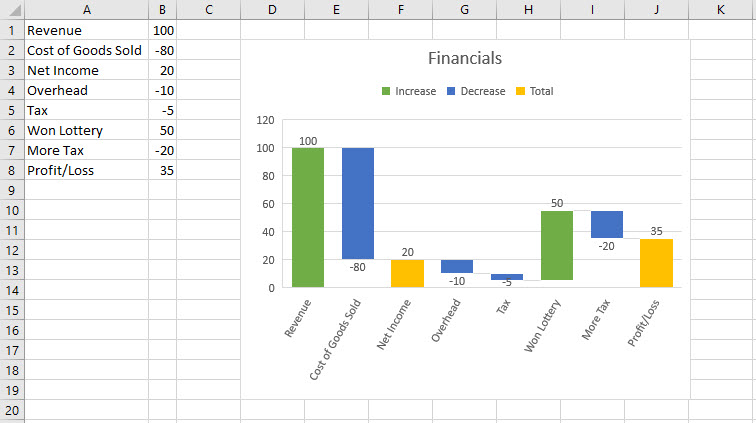
A waterfall chart is a neat way to show the progress over time of a measurable process.
